Comfy and Stylish
The kitchen, living room, entrance, and dining room are all meticulously arranged, but what about the bedroom? Despite being a space we use daily and nightly, it often gets overlooked. This is likely because our visitors don’t spend time there, leading us to prioritize other rooms while neglecting our own personal space. However, the bedroom is the first room we see upon waking and the last before we sleep, making it an essential part of our home.
The bedroom should be a top priority, as it is designed for you and your spouse. This is where you reset, relax, and prepare for the day. It should meet your needs. Ask yourself as you look around the room: Do I want this space to energize me for the day, inspire me, or be my peaceful escape to recharge? These questions will guide you in choosing a color palette, textures, lighting, and the perfect artwork to decorate your home.
When it comes to home decor and its complementary artwork, you can either buy the artwork first and decorate the room around it, or leave the art piece for last to complement the room. There’s no right or wrong answer. Most of our clients choose to buy everything else and leave the artwork shopping for the very end. If it’s not a vacation home, you likely need a new sofa, bed, and other functional furniture before the art.
In this example, we’re choosing the artwork as the final touch to make this bedroom shine.
Make Every Inch Count
Now that everything else is set, let's focus on the perfect spot for a piece of artwork that resonates deeply with you. This isn't for your guests—it's a special piece for you and your partner. Let’s make it truly meaningful!
Before choosing painting styles, assess your wall space and surrounding decor. Our goal is to maximize the space effectively. For instance, if you have a large king-size bed, you might think you need equally large artwork. However, the surrounding decor, like curtains, can reduce the available wall space, making it more suitable for medium to small, intimate art pieces rather than something bold and loud.
As true artists, we suggest starting with a rough sketch. No drawing skills? No problem—this is just for you. Grab a pencil and start sketching. You can use our graphics as a starting point, and if you’d like assistance, feel free to email us. We're happy to create a few mock-ups to guide you.
Measure your wall to determine the appropriate size for your artwork and consider if a gallery wall might work. After sketching, use painter's tape to outline your preferred artwork sizes on the wall. This allows you to visually gauge the space the art will occupy and live with it for a few days to see how it feels—an excellent way to make an informed decision.
To simplify the process, we've provided a few graphics to assist you with this creative project. In the example, the king bed mattress is 76” wide, with the bed frame being slightly larger. We'll use the bed as an anchor point since these dimensions are common and easily found.
Symmetrical Decor
The decor in this space is very symmetrical, featuring pairs of lights, nightstands, curtains, and even pillows. When choosing artwork, consider whether you want to maintain this balanced look with a pair of prints or paintings, or mix it up with a single canvas. Another way to keep the symmetry with a single painting is to mimic shapes. For example, the king bed and headboard are large horizontal shapes in the middle of the room, which can be mirrored by the artwork to maintain balance.
To help you visualize, let’s explore canvas options, starting with 48” width paintings and working our way down.
48” x 36”: A 48” wide canvas is the largest we recommend for this space. Anything larger may look too crowded and encroach on the curtains. To maintain balance and harmony, ensure each element has its own space, especially in a clean, organized room like this. The 36” height works well with 8-foot-high walls, allowing the top of the painting to hang just below the curtain height. We suggest using the top of the windows as a guide for the painting's height; anything higher might make the space feel top-heavy and create visual tension. Keeping the painting between 36” to 40” high will make the room feel taller as it draws the eye upward.
48” x 30” and 48” x 24”: If you prefer a more horizontal feel, opt for a shorter canvas like 48” x 30” or 48” x 24”. This size allows for a more subtle impact, making the painting more discreet depending on the colors and scene. All three sizes work for the space; it depends on your intent. Do you want the painting to cover most of the wall, or serve as an accent rather than a centerpiece?
40” x 30”: If the 48” x 30” or 48” x 24” paintings feel too elongated, consider a 40” x 30” painting for a smaller, more intimate option that still covers enough of the wall. This size allows you to hang it a bit higher, centering the canvas on the wall and giving it equal space on all sides. This creates a perfectly symmetrical look, serving as a focal point without enhancing the room's height or width. Our best advice would be to avoid choosing anything smaller than this canvas if you prefer a single painting on the wall. If you are considering sets, then two smaller paintings or prints would work perfectly well.
Square Artwork
Alternatively, a square painting can also work well in the space. Just be careful not to choose one that's too large. A square painting will contrast with the bedroom's horizontal shapes while maintaining a symmetrical feel and preserving the room's balanced look. Additionally, a square canvas will leave more space between the painting and the curtains.
48” x 48”:In this example, with 8-foot ceilings and the size of these windows, a 48” high painting is too tall. If the ceilings and windows were taller, this size would be perfect. Keep that in mind if your home has high ceilings and large windows. For this specific space, we do not recommend this canvas. As shown in the visual example, a 48” x 48” canvas is too large and overpowering, extending above the windows and curtains and disrupting the room's balance.
36” x 36”: This square painting is ideal for this space because the bare wall acts as a frame, perfectly centering the artwork. Hanging the bottom part closer to the headboard helps anchor the piece. While vertical paintings may not suit this horizontal space, a square option provides a balanced and centered look.
Gallery Wall
Gallery walls can be a bit intimidating, even for experienced designers, because there are many elements to consider. It's like assembling a puzzle without a picture for reference. Don't worry! We'll use a single print size per example in the following examples to keep things simple. While we won't delve into colors, textures, or forms, we will focus on arranging the artwork and exploring different setups.
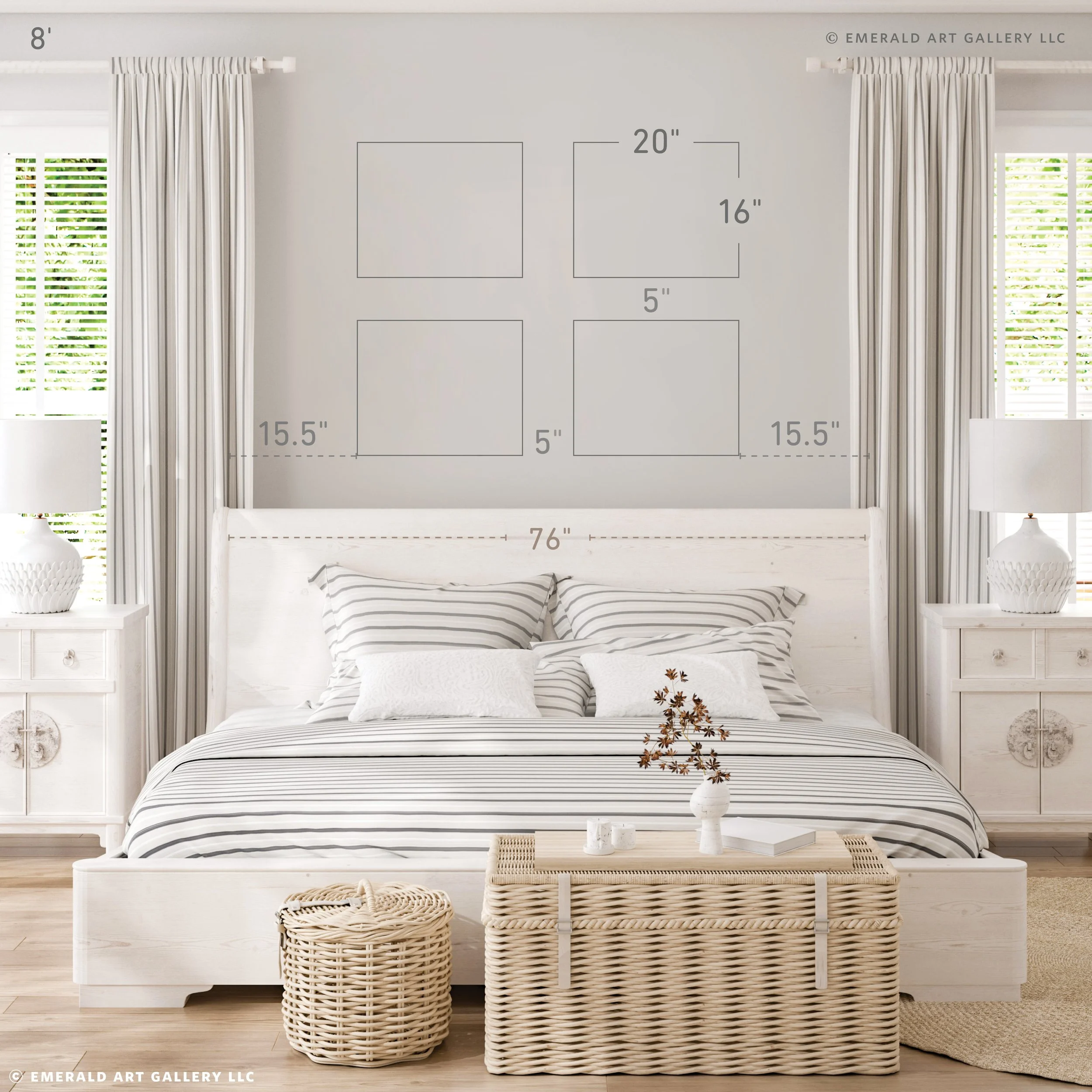
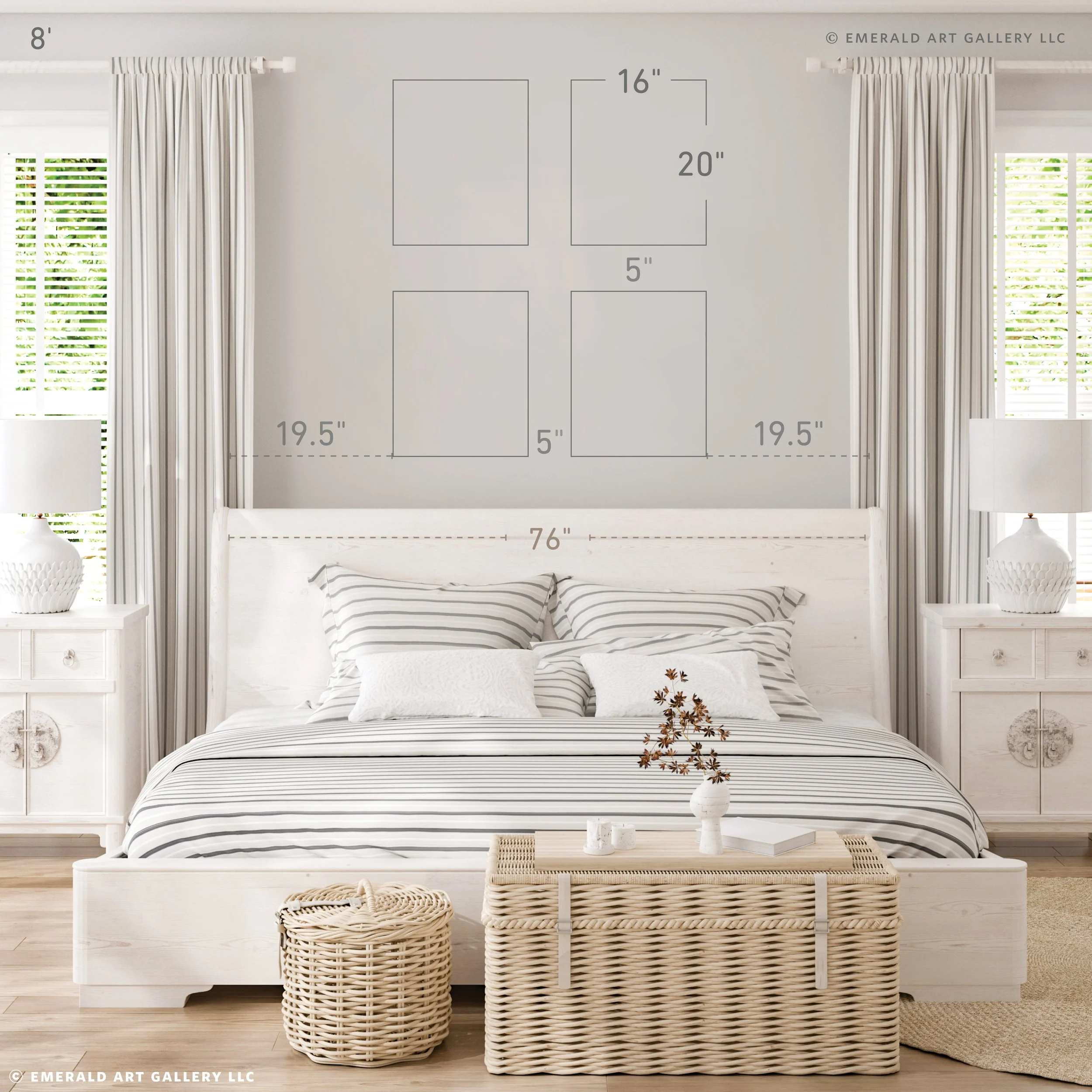
16” x 20”: The neat part about working with smaller-sized artwork is that you can arrange it in a few ways. In the case of 16”x20” artwork, it can be placed in a set of four in this space, horizontally or vertically. However, just because it fits doesn’t mean it works.
Four vertical 16”x20” prints or original artworks with five inches between each piece would hang too high on the wall to be effective. As shown in the diagram, the grid will cross the barrier. The top of the artwork would hang as high as the curtains, creating visual tension and causing the top of the grid to look top-heavy.
“Just because it fits doesn’t mean it works”
Keep in mind that grids work like a single piece of artwork. Because of how they are grouped, our minds and eyes see them as a whole, not as individual pieces. This is not the case with all gallery walls; some are more organic and freeform. However, the one we are working with is a bit more formal.
20” x 16”: If we arrange the artwork horizontally, the grid will have enough space around it to avoid feeling crowded by the surrounding decor elements. It is also short enough to stay below the top barrier. The top of the grid sits slightly below the windows, making it more compatible with the horizontal shape of the area. For those on a budget, this grid layout is great for limited-edition prints. You can include frames by adding a few extra inches or opt for a simple glass display. Visit our print gallery to find four 11” 14” prints on 16” 20” mats that perfectly complement your space.
11” Wide x 14” Tall
11” x 14”: A gallery wall with six 11”x14” prints or paintings would be an excellent choice for this wall. Leaving five inches between each print creates enough space for the artwork to breathe, ensuring nothing feels crowded or overwhelming. Each design element has its own space, contributing to a balanced look. If you’re on a budget, this grid layout is ideal for limited-edition prints. Add a few inches per square for the frames, but this layout works perfectly if you prefer just glass. Check out our print gallery for five 8”x10” prints on 11”x14” mats that work for your space.
Artwork Set / Diptych
When considering a set of paintings for your wall decor, look around to ensure you don't already have too many sets of decor accents in the space. Often, we find something we like and, without realizing it, repeatedly make the same choice, creating patterns. We don’t notice it until it's too late. While there's nothing wrong with using sets of decor elements, it might make the room feel monotonous if that's what you enjoy. Decor is like music; it needs highs and lows. Just as with art, you need a contrast of colors and shapes. Given that many sets of elements are already in the space, a gallery wall or a single piece might be best.
20” Wide x 34” Tall
20” x 24”: The most important thing to keep in mind is your intent. If you want to keep this room calmer, a set of paintings would work. We recommend a set of two 20” x 24” art pieces with five inches in between. They allow enough space without feeling crowded or competing with the surrounding decor pieces. They also maximize the space, and they stay well below the barrier.
We hope these diagrams and descriptions assist you with your home decor needs. Remember, these are guidelines, not strict rules. Our suggestions work for the examples we share, but they may not fit every home or space. To get a better understanding of your specific wall, please feel free to reach out to us. We are happy to create custom mock-ups like the ones you see here using an image you provide.
Your Sanctuary
This is your bedroom, so feel free to disregard any rules that don't resonate with you and make it your own. The design and organization of your bedroom can significantly impact your emotional well-being, so creating a space that supports your mental health is essential. Ultimately, how you decorate your room should be for your satisfaction alone. Nothing is permanent—you can repaint a wall or change your artwork if it doesn't fit. Make informed decisions, but choose what feels right for you.


